A&M were responsible for some great LP covers over the years, "Whipped Cream" and the Baja Band's goofy covers just for starters. Some other companies were not so lucky. If I had to pick a label with the worst art direction (if that's the word,) I'd pick Dot in the mid-60's, with their all-type covers that had as much appeal as a generic white box labeled CORN FLAKES.

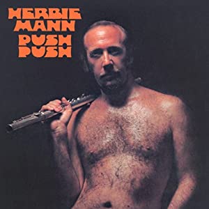


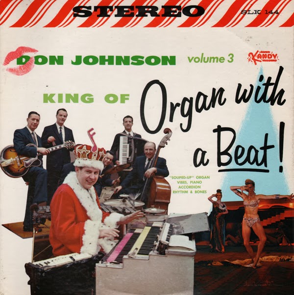
 Plenty of talent, though.
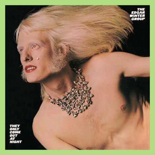


 Don't say I didn't warn you!)