CARPENTERS: Cover to Cover

Which Carpenters Album Cover Is Your Favorite?

  • "Offering"

    Votes: 1 1.9%
  • "Ticket To Ride"

    Votes: 2 3.8%
  • "Close To You"

    Votes: 4 7.7%
  • "Carpenters [S/T] a.k.a. TAN album"

    Votes: 3 5.8%
  • "A Song For You"

    Votes: 4 7.7%
  • "Now and Then"

    Votes: 7 13.5%
  • "Horizon"

    Votes: 13 25.0%
  • "A Kind Of Hush"

    Votes: 3 5.8%
  • "Passage"

    Votes: 4 7.7%
  • "Christmas Portrait"

    Votes: 2 3.8%
  • "Made In America"

    Votes: 0 0.0%
  • "Voice Of The Heart"

    Votes: 2 3.8%
  • "An Old-Fashioned Christmas"

    Votes: 0 0.0%
  • "Lovelines"

    Votes: 3 5.8%
  • "As Time Goes By"

    Votes: 3 5.8%
  • "The Singles, 1969-1981 [SACD]"

    Votes: 1 1.9%

  • Total voters
    52
Status
Not open for further replies.
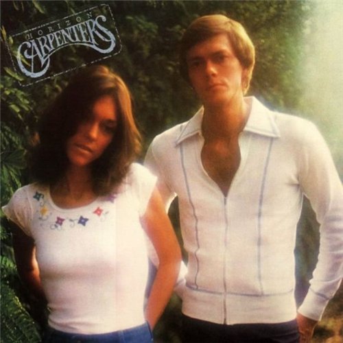
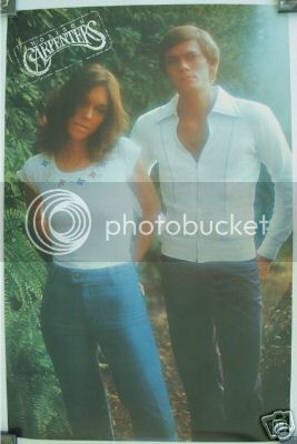
I've always been surprised by all the love for the Horizon cover (which is currently in the lead by a landslide). While I don't hate it and it's certainly not their worst cover, I just don't get the huge appeal it seems to have among the majority of fans. In my opinion, it's just not a very good photograph of them. It looks slightly blurry or out of focus to me. Neither of them are smiling. Richard actually looks like he's ticked off at the photographer and just wants to get it over with. Karen is kind of staring off into space like she's totally bored. Two-thirds of Richard's face is in shadow. There is no album title or logo (which is not a negative in and of itself, but could have really improved the cover, IMHO).

What am I missing about this cover that makes it the favorite of so many? I'm really trying to see it.
 
I've always been surprised by all the love for the Horizon cover (which is currently in the lead by a landslide). While I don't hate it and it's certainly not their worst cover, I just don't get the huge appeal it seems to have among the majority of fans. In my opinion, it's just not a very good photograph of them. It looks slightly blurry or out of focus to me. Neither of them are smiling. Richard actually looks like he's ticked off at the photographer and just wants to get it over with. Karen is kind of staring off into space like she's totally bored. Two-thirds of Richard's face is in shadow. There is no album title or logo (which is not a negative in and of itself, but could have really improved the cover, IMHO).

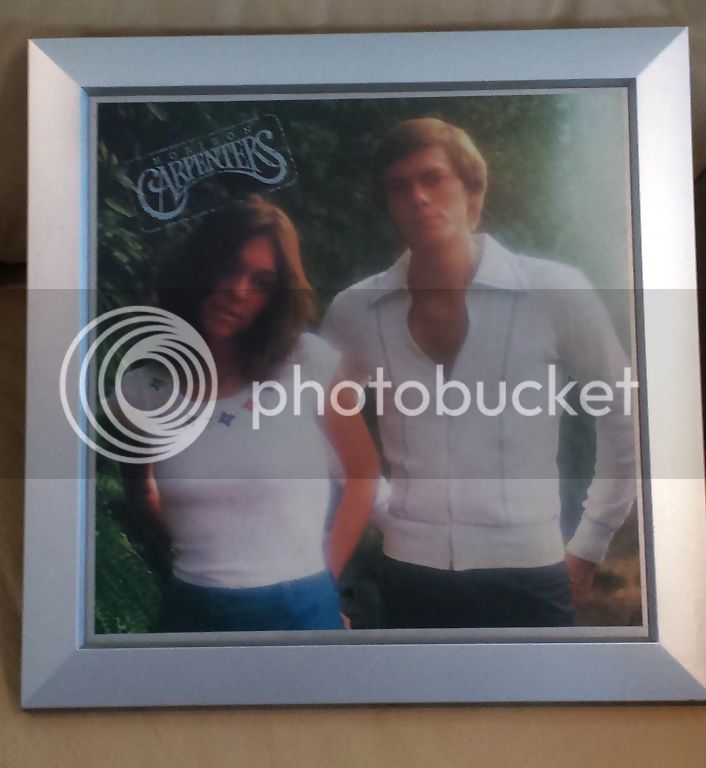
The thing that's always bothered me about the cover is the right hand side. It looks like the picture has been scorched white by the sun. I've never liked that. Is that a deliberate effect on the photo or the effect of the sun on the lens? Either way, it's awful and spoils an otherwise great cover. Other than that, it makes them look hip and cool. They're not smiling and they're not cheek to cheek for once. I think that's why so many people go for it. Oh and the logo was there in the form of a sticker on the jacket sleeve. In which territories did they do that? I've seen some with it, and others without.

carpenterskansic.jpg
 
Wow, newvillefan. Just adding that title/logo graphic and cropping out the border makes a huge difference!!! It actually looks more "finished" now. I like this version much better. (I may swap this one with the original on my iPod.) Thanks for posting that.
 
Let's see....morning opening quietly...bright sun to the right...setting the scene....well it could be.
For me, this cover shows them in a whole new light...gone are the goofy clothes, tacked on smiles, we see Richard in a more natural state and the outside shot coincides with the gardens in the video. It is finally that we see Karen dressed like she is a woman, the head tossed to the side is just a sexy look.
 
In the UK we had the sticker on the front - I've actually got one LP with the sticker on the left as per the pic above and another one with it on the right, on Richards side.
I agree, it's because they aren't cheek to cheek and smiling that I find appealing. It's different and unusual. Like Barbra Streisand's 'People' album cover where it's a back view. It's cool and non conformist. It takes them away from those cheesy covers. ( A pity it went back to that with AKOH ).
The fact that Karen is looking to the side very wistfully, makes the whole result intriguing. They both look amazing, Richard is broad and slim, Karen - albeit slim - very pretty, trendy and appealing - to men and women. She has a nice figure and cool clothes. They are casual and not preened and tweeked. It reminds me of the ticket to ride cover. 'Natural'.
Of course, personal taste is just that - personal. So of course it won't grab someone in the same way, but that's the joy of us humans - we are all different.
The UK cover of the 'tan album', has the inside picture as the main cover, rather than just the 'Carpenters' logo, i much prefer the logo cover. I do have that on the cd now, and I have a japanese import of the LP, with the full envelope system.
On the whole I think the Carpenters albums are good. CTY perhaps is my least favourite, followed by AKOH. I adored MIA when it was first released, but not so much now.
 
The thing that's always bothered me about the cover is the right hand side. It looks like the picture has been scorched white by the sun. I've never liked that. Is that a deliberate effect on the photo or the effect of the sun on the lens? Either way, it's awful and spoils an otherwise great cover. Other than that, it makes them look hip and cool. They're not smiling and they're not cheek to cheek for once. I think that's why so many people go for it. Oh and the logo was there in the form of a sticker on the jacket sleeve. In which territories did they do that? I've seen some with it, and others without.

carpenterskansic.jpg
I didn't vote this as my favorite one, but I like it. I too think the appeal is that they aren't wearing the 'pepsodent smiles' and it doesn't look lovey dovey. It's a picture of two serious musicians and reflects the more somber mood of many of the songs. I think it's cool. My 2 cents.

I picked the Passage cover. I was studying art at the time, and it really caught my eye. Plus I kind of liked the no picture on the cover aspect, though I was hoping for one on the sleeve.
 
It appears that (at least, from my vinyl collection) the later vinyl pressings of the Horizon album
placed the logo/album name on the 'back' cover, over and to the left of, Karen and Richard's photograph.
In part, because later pressings omitted the Flip-Up Cover from the front of the album.
There are vinyl pressings that do not have that big front flap which would have carried the logo/name.
(I'm assuming someone did this to lower cost of production on later pressings--omitted the front flap)
My USA (later) pressing not only has the logo/name on the back portrait--it is placed there covering a portion of Karen's hair.
It appears to be affixed on top of the album, not pressed-into (as initial part of) the cover.
It is extraneous.
Also, IMHO, very irritating.
(Later issues of the tan album and A Song For You omitted the nifty original Album Sleeves as designed,also.).
 
I've never seen an actual HORIZON cover with the logo, other than in pictures. My one LP copy and all CD copies have no writing at all on the cover - just the picture with the silver border.

Harry
 
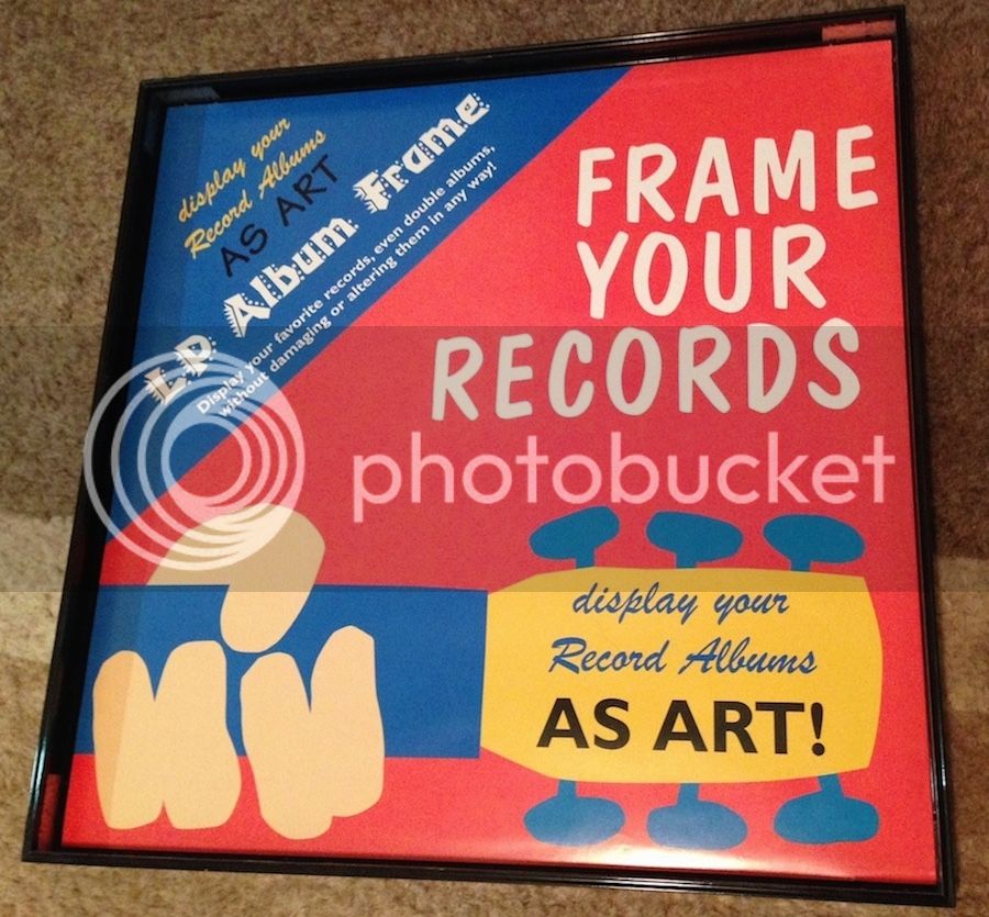
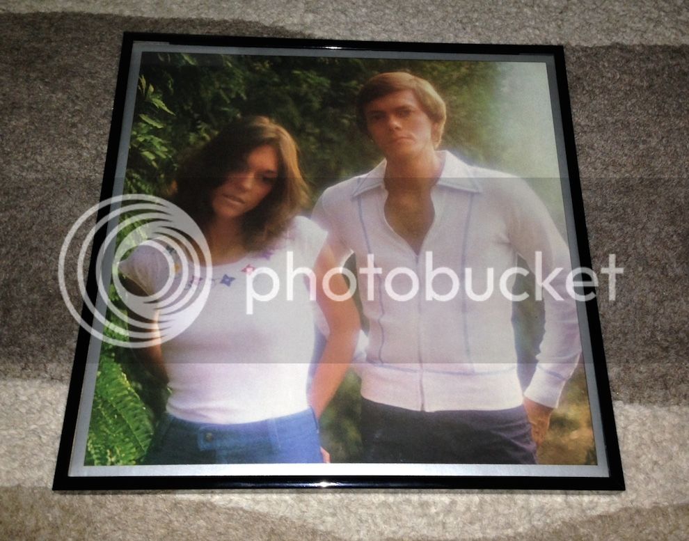
I bought this LP record frame years ago and I have it displayed in my music room, at least once a month I change it to display one of my many albums, soon it will be time for Christmas Portrait to grace my wall. Here is the Horizon LP, any glare you see is due to flash and I had to remove it from the wall due to the glare but this LP is mint. To me....it's like a work of art!!!!

LPFrame.jpg~original

HorizonLPFrame.jpg~original
 
I always thought of the light being the sun rising in the east. . .a new day/horizon. . . Aurora as the day begins. . .and brightening their brilliant white garments as the group begin a new chapter.
 
I like this longer shot of the album cover photo, used for their 1975 tour program cover (with the note at the top right, "Program Price $2.00" :wtf:)

carpenters1975horizon.jpg
This full shot just emphasises how much Karen's body shape had changed, she looks great, but there was nothing drastically wrong with Karen's shape for the "Now & Then" photo shoot. Karen obviously was not happy with her figure around '73, and she did a great job in achieving her weight loss. If only she had realised her obsession was spiralling out of control. She must have lived from day to day, on nothing more than nervous energy. Frankly, I'm amazed Karen survived as long as she did, she was a fighter.
 
Chris Mills, I share your sentiment , above.
Quite interesting, by the way, to go through the photographs in each tour/souvenir Program,
year to year.
 
That's awesome Chris - I saw one online and it was indeed a poster, probably sold via the fan club as you suggest.
 
It may be a fan club poster, but I do not have it. I'll have to double check the Newsletters.
I rather suspected it to be an A&M promotional poster for record venues.
But, I love it!
 
I just noticed this Horizon promo poster is on sale now at ebay so it does in fact exist, says it's 24x36 so this thing was huge. It's too bad it's in such poor condition or I would buy it. How could someone not have taken care of such beauty? It boggles the mind. Wrinkles and roll marks oh my.
 
I agonized for 5 minutes over this question before finally voting for Lovelines. I like every cover to varying degrees with the exception of Hush, which to me just has a "yuck" factor to it. I think the photo was airbrushed (poorly!) and it makes them look like they have bad spray tans. Then of course there's the whole steamy/sweaty tone- I don't know why they agreed to it. Weren't they sick of being the "incestuous" pepsodent twins? I get the concept, I just don't think the followthrough was there.

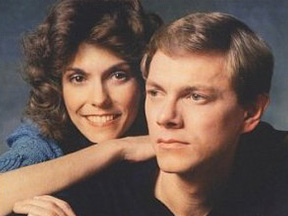
Anyway, I really like Offering and Horizon, I like SFY in spite of myself, love Passage and would totally dig a full size poster, and love love LOVE ATGB, the SACD, VOTH, and Lovelines. I settled on Lovelines mostly because it's a beautiful photo of the two as adults. There's a kind of serenity in that photo that I can't put into words. Somehow that photo stirs up happiness and melancholy in me at the same time.

I said Lovelines cover, but I like this shot better than the one featured on the front.
richard+carpenter.jpg


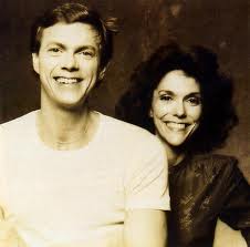
On a similar note, this is one of my all time favorite photos of them:
carpentersWQ.jpeg
 
I don't think I've seen the shot directly above. I really really like it. Rich looks normal in that he's not squinting or looking bothered or uneasy. Karen is very pretty but those eyes say so much. Does anyone else notice Karen's eyes in most photos they don't lie. They express. The girl had courage. Might sound like a funny word but to look thru those eyes and smile a lovely flash is extraordinary to me. The pic's a great representation of the later years and mature CarpenterS. A great cover me thinx. I had a PASSAGE promo poster that was something like 5'x5' when I went exploring at 14 ( ran away ) my Mother was so pissed and disrespectful that she ripped it from the ceiling where it was tacked ever so cool above my bed. Shredded. Hmmmmm. It was so vibrant and abstact n artsy til it met my Mothers rage. Still pondering the retribution. Can I forgive? MMMMM yeah. However when I hear of the same promo the ol scab begins to lift and me thinx bad thoughts that have nuttin to do with forgiveness. Louise Fletcher's Agnes had nothing over my loved ones tantrum. Funny how resentment can linger with some. Defiling Karen Carpenter(S) tho is a Ticket to Hell and he don't care.

Jeff
 
I agonized for 5 minutes over this question before finally voting for Lovelines. I like every cover to varying degrees with the exception of Hush, which to me just has a "yuck" factor to it. I think the photo was airbrushed (poorly!) and it makes them look like they have bad spray tans. Then of course there's the whole steamy/sweaty tone- I don't know why they agreed to it. Weren't they sick of being the "incestuous" pepsodent twins? I get the concept, I just don't think the followthrough was there.

Anyway, I really like Offering and Horizon, I like SFY in spite of myself, love Passage and would totally dig a full size poster, and love love LOVE ATGB, the SACD, VOTH, and Lovelines. I settled on Lovelines mostly because it's a beautiful photo of the two as adults. There's a kind of serenity in that photo that I can't put into words. Somehow that photo stirs up happiness and melancholy in me at the same time.

I said Lovelines cover, but I like this shot better than the one featured on the front.
richard+carpenter.jpg


On a similar note, this is one of my all time favorite photos of them:
carpentersWQ.jpeg
The alternate Lovelines shot looks just as good in B&W and could be an awesome cover.
 
I'm glad Horizon is winning - as it is one of my favorite photographs, as is the album... But I voted for Now & Then - simply because it is the very first album I purchased, and when I unwrapped that cellophane, it was like Christmas morning, all wrapped up in a tri-fold miracle. I studied every inch of that cover when I listened - over and over again.
Another intriguing cover for me - that I enjoyed immensely, was The Singles, 1969-1973. So rich, and lush, and as they often did, this album set a standard in Greatest Hits collections.
And I also wanted to send an honorable mention out to the album, Love Songs. I mention this, because the logo was featured, and this is the last time I recall that a "new" release made a worthy splash on the Hot 200 - where new consumers could first find, see, hear, touch, and live Carpenters material.
 
Status
Not open for further replies.
Back
Top Bottom