Navigation
Install the app
How to install the app on iOS
Follow along with the video below to see how to install our site as a web app on your home screen.
Note: This feature may not be available in some browsers.
More options
You are using an out of date browser. It may not display this or other websites correctly.
You should upgrade or use an alternative browser.
You should upgrade or use an alternative browser.
Christmas Album Covers - Favorites Poll
- Thread starter K.C. Jr
- Start date

tomswift2002
Well-Known Member
On Portrait the logo is difficult to see, but it's there on the front cover.I like Christmas Portrait better, but still- there's just something about seeing that Carps logo on the front of an album. Makes them both good.")
K.C. Jr
Well-Known Member
I agree; that logo really stands out. It's definitely one of the classiest I've seen!I like Christmas Portrait better, but still- there's just something about seeing that Carps logo on the front of an album. Makes them both good.
K.C. Jr
Well-Known Member
My favorite Christmas album cover of all is the first Mannheim Steamroller Christmas album.
Yes! That one is amazing!
newvillefan
I Know My First Name Is Stephen
MorningOpensQuietly
Well-Known Member
Bah humbug indeed! Sounds like you are in need of some spiked eggnog to take the edge off! Ho-ho-ho...I don't like either, they both reinforce the cheesy image the duo tried so hard to shake off. The 1978 album has a non-logo version of their emblazoned across it and the 1984 album reminds me of the inner sleeve photos on the Now & Then album - they look like chipmunks.
Bah humbug

Graeme
Well-Known Member
I agree. I also find the elves a tad creepy.I don't like either, they both reinforce the cheesy image the duo tried so hard to shake off. The 1978 album has a non-logo version of their emblazoned across it and the 1984 album reminds me of the inner sleeve photos on the Now & Then album - they look like chipmunks.
Bah humbug
Toolman
Simple Man, Simple Dream
I actually like the concept of the "Christmas Portrait" album quite a bit. It's a far cry more creative than most of their album covers! The only thing I don't like about it is the illustration of K&R that "Santa" is painting. It copies an old picture of Richard from the "A Kind of Hush" photo sessions and one of Karen that looks like it might have been taken from "Passage"-era photos. For me, it gives the LP cover a sort of cheap, patchwork feel when they could easily have drawn a classy, new illustration representing the duo from '78. Picky, picky...
newvillefan
I Know My First Name Is Stephen
I actually like the concept of the "Christmas Portrait" album quite a bit. It's a far cry more creative than most of their album covers! The only thing I don't like about it is the illustration of K&R that "Santa" is painting. It copies an old picture of Richard from the "A Kind of Hush" photo sessions and one of Karen that looks like it might have been taken from "Passage"-era photos. For me, it gives the LP cover a sort of cheap, patchwork feel when they could easily have drawn a classy, new illustration representing the duo from '78. Picky, picky...
They should have used Chris Tassin's artwork for the picture of Richard and Karen

Another Son
Well-Known Member
I was disappointed as a teen that 'Christmas Portrait' didn't include an actual photo of Karen and Richard. I have recently thought that the promotions people might have thought that Karen looked too ill to be photographed, but, then again, she did appear in tv specials and promo appearances around that time. The Bruce Forsyth appearance shows what she was like at the end of '78, when 'Christmas Portrait' was released - the thinnest I've ever seen her. I would still prefer a photo to a painting on the cover of the album, though. That would present those intensely personal, evocative and touching vocals and songs in a more warm and personal way, visually.
I don't like either, they both reinforce the cheesy image the duo tried so hard to shake off. The 1978 album has a non-logo version of their emblazoned across it and the 1984 album reminds me of the inner sleeve photos on the Now & Then album - they look like chipmunks.
Bah humbug
the cp cover was what led me to think something was wrong. passage had no photo, then cp has an illustration pf a photo that was at least two years old. something just didn't seem right considering major photoshoots taken for other albums.
Carpe diem
Well-Known Member
Have to go with "Christmas Portrait". Such great detail. Santa sitting on the stool dipping his brush and the elf trying to keep the jar of paint from spilling over. Santa painting the duo from photo pinned to his easel. And I prefer the standard "Carpenters" in black over the official logo in this case.
Simon KC1950
Well-Known Member
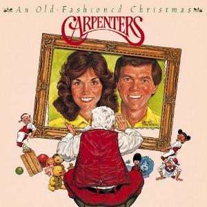
Richard does not like "An Old Fashioned Christmas" cover. Here's what he has to say about it:
"Additionally, it was my ill-conceived idea to ask the artist Robert Tannebaum, who did such a clever job with the 'Christmas Portrait' cover to have a go at the new cover, not remembering that "Lightening doesn't strike twice in the same place". The resulting cover doesn't come close to the original, in no small part due to the fact that, for some reason unknown to me, he decided to position Karen as tall as I! This looks a bit odd to my eye, as I'm 6' and Karen was 5'4 "
"Additionally, it was my ill-conceived idea to ask the artist Robert Tannebaum, who did such a clever job with the 'Christmas Portrait' cover to have a go at the new cover, not remembering that "Lightening doesn't strike twice in the same place". The resulting cover doesn't come close to the original, in no small part due to the fact that, for some reason unknown to me, he decided to position Karen as tall as I! This looks a bit odd to my eye, as I'm 6' and Karen was 5'4 "
tomswift2002
Well-Known Member
I don't get Richard on the Old-Fashioned Christmas artwork, as Santa could've taken artistic liberty and just painted Karen at the same level as Richard. The only major thing is that the front painting canvas is rectangular while the back of the LP features a square canvas.
But I like how both covers remind you of a Christmas Card and that's what I think they were going for with the Christmas Portrait cover: Here's a Christmas card from the Carpenters.
But I like how both covers remind you of a Christmas Card and that's what I think they were going for with the Christmas Portrait cover: Here's a Christmas card from the Carpenters.
Someday
Well-Known Member
I always thought An Old-Fashioned Christmas was fine. The 'hight difference' thing hadn't really registered, as I thought Karen was in the foreground, and would therefore be taller. The painting might have been improved if they were wearing red or green, instead of yellow. Plus, it has a really nice type-face for the text. If only there'd been an inner sleeve ...
John Tkacik
Well-Known Member
It would appear that Mr. Tannebaum used the inner sleeve photo from Made In America as his inspiration for the AOFC illustration and he may have playfully dealt with Karen's height difference by tilting her end of the frame up to bring her up to Richard's level. Maybe there was another photo of them taken in a similar pose where Karen was not wearing the sweat shirt.
cam89
Well-Known Member
I also do not like how Karen's hair does not fall normally down if she were standing as opposed to the seated, leaning forward photo inner cover of mia.....it's obvious the artist took the photo of inner sleeve of mia....and having them almost cheek to cheek at same height....surprised rc did not have a say abt this LPGA cover, as he did re: now and then, a song for you....just not a great album cover
Similar discussions
- Replies
- 8
- Views
- 340
- Replies
- 4
- Views
- 127
- Replies
- 26
- Views
- 675
- Replies
- 4
- Views
- 792