• Our Album of the Week features will return next week.

GOING PLACES album jackets

Status
Not open for further replies.

thetijuanataxi

Well-Known Member
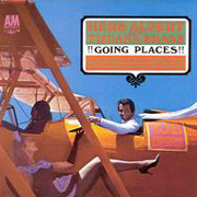
Can anyone tell me why there is such a range of different colors, shades, tints and gloss on different copies of the GP album jacket. The one I remember most vividly throughout my childhood had a sky or medium blue background like the sky on a sunny cloud free afternoon, vibrant red and green on the Mexican flag and the letters were so vivid that they would appear to be bouncing on the jacket if you moved it back and forth, while Herb's face was shaded to make him look Mexican. I have in the last few years aquired around 10 sealed, mint condition copies of the album, trying to find one like that. But EVERY copy I have and have come across sealed/mint and these are standard issue USA 60s pressings, not record club, has had either very dark, very light (perriwinkle), dull, almost like the album cover is housing a blues album. I have seen at least 5 or 6 differnt shades/ hues of the blue background on different jackets. Some look as if the shot was taken at twilight and Herb looks more black than mexican. Little if any vibrance to the colors. The only copies I have found that have the cover as I remember it in the 60's colorwise are used, open copies that have worn beyond the level that I want. Why is it so difficult to find the album jacket as I remember it, even sealed/mint? The only other TJB cover that has a similar oddity is THE LONELY BULL. Why is there this difference?

David,
confused
 
I don't know how to answer or comment on the above, but I do have another question...

On the back of the GOING PLACES album cover in small print on the side it says "Photographed at Movieland of the Air, Santa Ana, California."

I have tried to find out about Movieland of the Air without any success.

What is/was it? Is it still there? Where is or was it? (I know how to find Santa Ana, California).

Does anyone know anything about that place?
 
Well, what do you know?

I'm finding out a little that I have never found before. Evidently, Movieland of the Air is a museum at the Orange County, California airport at Santa Ana. The whole name is Movieland of the Air Museum. Evidently some kind of aviation museum connected to the airport...

I'm still searching and reading...
 
IIRC, It was at one time owned by the same people who owned the "Movieland Wax Museum" as a place to put airplanes, vehicles and military equipment used as props in films. Later, when competition form Orange County's bigger tourist draws (Disneyland & Knott's Berry Farm) became too much they decided to concentrate on just the Wax Museum. It's good to know the museum still exists and is (I assume) attached to the Santa Ana Airport... I went there with my Dad when I was but a wee one (and before I was a TJB fan).

I believe the Air Museum is owned by a groujp of aviation Hollywood stuntmen. Meanwhile the Wax Museums are owned by the same folks who own the Ripley's chain of attractions (with both the Wax Museum and a Ripley's mere blocks from Knotts).

--Mr Bill
 
Allright guys and gals. Now that the Movieland of the Air Museum question has been answered, could I please have the insight of all the A&M Records experts in reference to the "Original" topic of this thread, the GOING PLACES jacket color variance?

David,
politely asking posters to start another thread if their post isn't relevant to the topic being discussed..........
 
sp4112.jpg


I don't know too much about the printing process in regards to album covers, but there surely must be something in the actual explanation that will have to do with variations in the process: color ink, dyes, paper, manufacturing plants, etc.

Perhaps there's even a chemical explanation in there somewhere, since the two GOING PLACES LPs I have that still have shrink-wrap on them tend to have more washed-out looking color than the ones without shrink wrap.

I see subtle variations in all of the copies I have, with the most natural-looking vibrancy coming from an ancient mono copy rescued from a radio station. This one has the 'slats' up where the A&M logo is looking the most natural shade of an ashen dark brown. The young lady's fishnet-stocking clad leg appears a neutral greyish color compared with other copies where reflected red-hues make it appear as it would during a sunrise or sunset. The contrast on this one is also the best in the printed-titles area. The green shade is darker, giving a better contrast with the red.

The next 'best' as it appears to me is actually the newest vintage in my collection, a '70s silver-label pressing. Though the picture overall has a more washed-out feeling about it, the 'TJB EXPRESS' sign has the best contrast of all of them - not easy to accomplish with orange letters on a fuschia background. On this LP, the green letters in the titles area have that shimmering effect on the red background.

Truly though, the best representation of this picture that I've seen comes from the Japanese CD POCM-1949. It looks the most like what I *think* it should look like. The US printing has that washed-out look about it, and the 'TJB EXPRESS' sign is almost unreadable.

Which brings up what's probably going on here. All of us have different ideas and preferences when it comes to color, and I don't believe that any two of us *see* in exactly the same way. If you've ever gotten into the "..it's blue. No it's purple. No, it's blue..." argument with anyone you'll better understand. Speaking of which, are the ruffles around the young lady's shoulders blue? Or purple? On this Japanese CD and the LP I think looks 'correct' they look almost bluish. On all of the others, they're more purple.

Harry
...wondering how Herb's more artistic eye sees these, online...
 
I'm sure a lot of it has to do with the printing plates and the fact that it went back to press many times over the 30 years it was available...

--Mr Bill
 
Mr Bill said:
I'm sure a lot of it has to do with the printing plates and the fact that it went back to press many times over the 30 years it was available...

--Mr Bill

I don't know a lot about how LPs are manufactured, but I do know something about printing processes. I've seen all those variations in the GP cover colors myself, over the years, and it's got to be because it went through so many printings, probably at several different plants. At each plant the printing presses are different, the press operators are different, the color checkers are different, the relative mix of CYMK inks is different, plates are burned from dup negs instead of originals, quality control varies, and so on. Pretty soon the "standard" color guide for this particular cover is shifted away from the original toward what looked good last time, what works now cause we gotta get these tons of albums out the door, etc.

Mike A
 
Mike A's post answers the question; I would have posted the same response. I've worked in printing for the last 30 years, and there are variations even during a single press run.

I'm more curious regarding the variations of the Ninth album cover, comparing the ads to the actual album, which involve actual changes in plating. I have the "It took eight to make nine" Life magazine ad, and it is different from the actual cover, in that "Herb Alpert & The Tijuana Brass" is yellow like the border around it, instead of the orange on the album (as if someone just masked the magenta separation). Not an earth-shattering item, but it's always stood out as different.

Dave T.
 
Are you sure that Dolores Erickson appears on the GP album cover? She doesn't feature it as one of the covers she appeared on in her web site.

David,
thinking he read that it was Sharon Moss
 
thetijuanataxi said:
Are you sure that Dolores Erickson appears on the GP album cover? She doesn't feature it as one of the covers she appeared on in her web site.

I have an interview of Herb's where he said she was used for "the next album as well" after Whipped Cream, so I assume he meant the Going Places album.


Capt. Bacardi
 
Status
Not open for further replies.
Back
Top Bottom