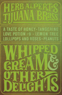
The Whipped Cream album cover: Stuff I never noticed before (due to staring at the Whipped Cream lady?)

Mike Blakesley

Well-Known Member
Staff member
Moderator
As you may remember, the Shout Factory edition of Whipped Cream and Other Delights came with a poster-sized print of the album cover folded inside the CD package. Somehow it wound up stuffed into one of my desk drawers at work, where I found it the other day while looking for something else. Currently it's lying on my desk with the "logo" side facing up.

As we all know, that album has been around for around 60 years and I've owned it in at least one format for over 50 years. So just today (and this is a major indicator of how big a nerd I am), I noticed for the first time that of all the letters in the cover logo, only the "A" in "Brass" is a lower-case letter. All of the other letters, including all the other A's, are in uppercase. Does this mean anything? Of course not, but I do find myself wondering why the typography artist chose to use a lowercase A in that one spot.

There are a couple of spots where the lowercase letter looks the same as the uppercase one (such as O or S), so there could actually be more than one lowercase letter in there, but... see, it's still possible to notice new things about something you're deeply familiar with.

Maybe Herb was running some contest in which the first person to spot this typography anomaly would win a million bucks. If that's the case, he can contact me through the Corner. :)
 
Just the text, so as not to distract. :D
Whipped Typography.jpg
It looks perhaps to be a function of the long tail on the R, with the following letter smaller and sitting on that tail. It is perhaps odd that a lower case 'a' was used in Brass, but an upper-case 'E' found it's way to CREAM. Note the smaller 'I' atop the tail of the 'L' in DELIGHTS.
 
I was going to post the graphic as well -- mine did include the "distraction" you mention (just the top half) but I got a phone call and didn't get a chance to add it.

The G in DELIGHTS is also kind of odd...notice how the bottom part of the G is just a straight line, but the top half has the little extender that would normally be on the bottom half. It's almost as if the character was upside down.

It would be interesting to see the "progress" steps of the creation of this logo.

Next week on Herb Alpert Minutiae... the Summertime disco pants.
 
What I always wanted to know was just what was with all the green dots between some of the letters?
 
Funny, I was 7 going on 8 when that album came out, so I didn't "get" the sexiness of the cover at the time. By the time I was old enough to care about such things, the world had moved to more serious matters, due to the unrest in the mid/late '60s. I'll bet it was fun to be an excitable 20-something dude in those days and spot that album cover for the first time.
 
Funny, I was 7 going on 8 when that album came out, so I didn't "get" the sexiness of the cover at the time. By the time I was old enough to care about such things, the world had moved to more serious matters, due to the unrest in the mid/late '60s. I'll bet it was fun to be an excitable 20-something dude in those days and spot that album cover for the first time.

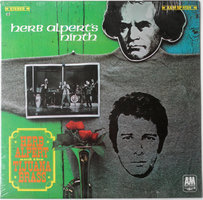
Early 1968. I was 11 going on 12. Herb Alpert's Ninth had just come out, Mom was going on a business trip to L.A. and I asked her to bring me the new Tijuana Brass album. Not figuring she'd remember the title, I told her it had a green cover.

R-10286705-1519498814-8192.jpg

She came home with Whipped Cream instead.


Apparently you can jump-start hormones with visual stimuli....
 
What I always wanted to know was just what was with all the green dots between some of the letters?
Well, I can guess at the answer to the 'what' but not necessarily the 'why'.

Whipped Typography.jpg
Look at the shape of the 'W' in Whipped. It slants upward leaving a bigger space between the W and the H at the bottom. Whatever the font designer had in mind, it looks like the dot was to fill in a bit of blank space.

Now look at the 'A' in Cream. It slants downward leaving a bigger space at the top between the A and the M. Again, that dot serves to fill in a larger blank space.

Look at the 'T' in both Other and in Delights. The top of the T uses up a lot of horizontal space, leaving more open at the bottom on both sides, so the two dots fill in the blank space. The oddity is where the T meets the S in Delights. There IS a dot on the right side, but likely wasn't necessary.
 
A reasonable explanation, Harry, but I have recollections of seeing dots, and other very small 'thingies', used by signwriters of old, to fill in spaces on signs. Probably a means of conveying the signwriter's skill and artistic ability? 😉
 
Back
Top Bottom