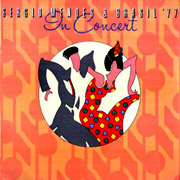
Worst Sergio Album Cover

Status
Not open for further replies.

Chris Martin

New Member
Using the same categories (Band, Sergio, Abstract):

Band: Love Music: while I love Gracinha and Bonnie's funky sateen outfits and turbans, the arrangement is just too coy, the font? cheap, piped frosting, the ever-increasing mirrored edges, yuk! I'm slightly irritated by the fact that the beaten-up post-game band players on the back cover have prsitinely clean soles to their football boots! However, Pele never looked so cute!
Sergio: Arara: it gets the imported exotica and spicey coloring all wrong, and the set is cheap -- red piano, macaw! Euww. (Speaking of spartan accessories, I quite like the Elektra Sergio Mendes album -- the turtle neck, the medallion, the canvas belt, the subtly built-up shoes, and the preponderance of the color cream. Sly Stone never looked so exquisitely "of his time"!
:laugh:
Abstract: the travel brochure lady on the cover of my Italian Alegria cover. What gives? Who was that for? Embezzlers just back from Rio who wanted to live the Cocabana dream? I'm also disgruntled by the tiled effect of Brasil 86!


Far more winners than losers, though! I feel the need to comment on the wonderfulness of Crystal Illusions but I've spent my vote!
 
When I say "arrangement" re. Love Music, I mean the arrangement of the band members on the cover, not the musical arrangement which, while licked and honeyed into submission, is beautifully of its time, beautifully Bell.
 
I WISH there was an edit button here!!!!!!!!!!
When I say "back cover/pristine football boots", I meant to mention I was referring to New Brasil 77!!!!
Imagine Bonnie and Gracinha in their flared white pant suits with contrasting turbans, sashes and jewellery, but in football boots!!! (no, actually, don't imagine that!
Bring on the metalic mules and painted toe-nails!
 
I WISH there was an edit button here!!!!!!!!!!
Chris, there IS an edit button, it's at the top right hand corner of every post you make.

As for Sergio's album covers, I can't disagree with you more. My least favorite of the ones you mention is the Elektra SERGIO MENDES, it's a cheap looking cover. I always liked the bright colors on the ARARA cover. I do agree about CRYSTAL ILLUSIONS, that cover suits the music perfectly.

The LOVE MUSIC cover is admittedly cheesy, but it's an artifact of its time. As for the font, you must remember that this was done before the computer age and that logo was hand-drawn, so it's really not a "font." I also like the back cover photos on that album.

I agree with you somewhat on BRASIL '86 -- I'm not a huge fan of that cover, but, the worst Sergio cover of all time is without a doubt, "MAGIC LADY."

My favorite of the covers, photography-wise, is STILLNESS. I really like the band pictures. Again, they fit the music totally. The center spread photo on VINTAGE 74 is great too...the front and back, not so great. They should've used the inside photo on the outside, might have sold more records.
 
Although I love the painting on the cover of "Ye-Me-Le", it's a little too abstract for a cover choice, don't you think?....I love Sergio's 70s bouffant hair and the big goofy sculpture on the Elektra album.....yes, "Magic Lady" is like a bad cigarette ad....."Love Music" may have been a little cheesy, but I still love it - it was the first Sergio album I ever owned.
 
Is "Magic Lady" the cover that looks like an outtake from an early Earth Wind & Fire photo shoot?? :D
 
I like the YE-ME-LE cover but I can see where it probably didn't sell too many records. I always wondered how they landed on that cover design.
 
Yes, Magic Lady is a bad Athena-style cover.

Ye-Me-Le is called What The World Needs Now over here in the UK. I don't think even that particularly helped sales of that magnificent album.
 
I have really never seen what I would call a "Bad Cover"... I really thought all of the Sergio Mendes (Brasil '66, Brasil '77) covers were fairly well-thought out and seemed to have "told some kind of story"... They just kind'a picked my curiosity more than have ever been anything that I would'a criticized or even called "mediocre"!


Dave
 
I've always disliked the IN CONCERT album's cover:

sp4378.jpg


After missing out on it for all of those years and then finally acquiring it - it was quite a disappointment, cover-wise. The contents are still great though!

Harry
 
To me, In Concert really looks like "people having a good time"; it would be nice if that sported a Group Shot... And Magic Lady doesn't seem to have anything there the title suggests, but I wouldn't call it a "worst" cover in that sense of the word... Even Sergio Mendes & Brasil '88, with Sergio holding the two Boom Box-radios is pretty cool...

I guess, to me, it's all personal taste, as far as what a "good cover" would surpass...


Dave
 
Without a doubt Magic Lady with 2nd place going to that stooopid one where Sergio's hoisted a boombox on his shoulder like he's kool an hip n sh!t wit da gang ting goin' on an sh!t.

All the Bell covers pretty much suck, but only because they are so dated with that disGo look...

--Mr Bill
 
The In Concert image (the two ancing figures) was also featured on an album called Making Whoopee but with a green rather than orange background. I have no recollection who the album was by. It used to be in the vinyl section at my local library years ago.
 
BTW, whenever I see the Brasil 86 "tiled" cover (audiophile, ebay, the Salute to Sergio Mendes -- (fabulous site)) it's always fully tiled, edge-to-edge. Mine's only tiled in the middle, with a broad white border. A UK thing?
 
I actually kind of like the cover to Magic Lady--in fact probably more than the music, LOL!!

IIRC (I sold my copy years ago), the UK release of Love Music is pretty hideous--a squatting female in a big straw hat taken from above. Topped only by the extra-hideous sound of the UK pressing itself. :wink:
 
I actually kind of like the cover to Magic Lady--in fact probably more than the music, LOL!!
Well I'll grant that the cover is at least as good as the music. They're both at the bottom of my Sergio scale.
 
OK, I forgot about the "intimidating mosaics" of ...Brasil '86; and just why WAS there an '86, if an '88 was "destined to follow"?! (And seemingly appropriate, as in '66, '77, '99, '00, etc.) :wtf:


Dave
 
Status
Not open for further replies.
Back
Top Bottom