newvillefan
I Know My First Name Is Stephen
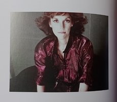
Having attended the UK premiere of the Karen Carpenter film last week, I was reminded anew of the difference between the eventual artwork on Karen’s solo album, versus some of the original photo session images. Such care went into that photo session by Claude Mougin and Karen was so badly let down, as were the duo over the years. Compare these:


If you were the Artistic Director and in possession of images as beautiful as this one of Karen, what would you have done for her album cover?
And, more generally, what would you have done differently on the Carpenters’ album covers? What would your ideal ‘Now & Then’, Tan album or ‘Close To You’ cover have looked like, given the era in which it was produced? Which image would you have chosen for the cover?


") I have to smile in spite of myself - but that's the 3rd or 4th time recently that someone's tried that rather flimsy attempt at humor, and you're wearing it out - how about something original and clever for a change!
I have to smile in spite of myself - but that's the 3rd or 4th time recently that someone's tried that rather flimsy attempt at humor, and you're wearing it out - how about something original and clever for a change!