Navigation
Install the app
How to install the app on iOS
Follow along with the video below to see how to install our site as a web app on your home screen.
Note: This feature may not be available in some browsers.
More options
You are using an out of date browser. It may not display this or other websites correctly.
You should upgrade or use an alternative browser.
You should upgrade or use an alternative browser.
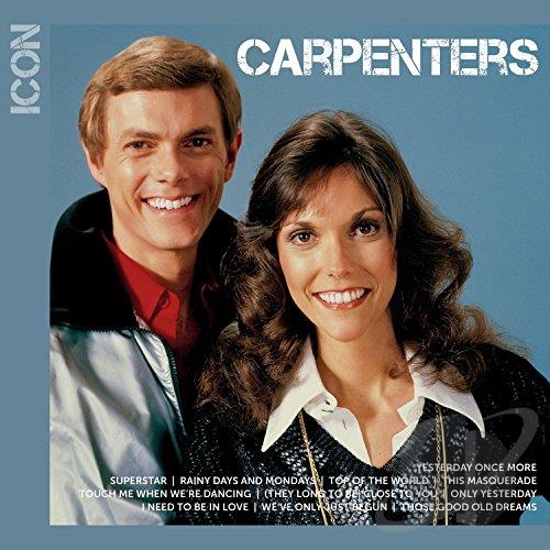
ICON (New CD Release)
- Thread starter Rick-An Ordinary Fool
- Start date
- Status
- Not open for further replies.

Joeyesterday
Well-Known Member
CD Universe has the CD cover image, but says Dec. 24,
Rick-An Ordinary Fool
Well-Known Member
Why did they use a Christmas photo, at least Karen looks great!!
Is the photo leaning to the left??? I feel dizzy.
Is the photo leaning to the left??? I feel dizzy.
Last edited:
Rick-An Ordinary Fool
Well-Known Member
Track Listing:
- Yesterday Once More
- Superstar
- Rainy Days and Mondays
- Top Of The World
- This Masquerade
- Touch Me When We're Dancing
- (They Long To Be) Close To You
- Only Yesterday
- I Need To Be In Love
- We've Only Just Begun
- Those Good Old Dreams
CarpentersToYou
Somehow you brought the gambler out in me...
You know, despite it being used for the Christmas Collection set, I way the cover looks for ICON. At least it's not the MIA session one. 11 tracks is quite miniscule. Looks like a "Highlights of YESTERDAY ONCE MORE"
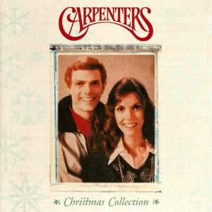
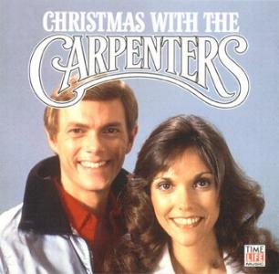
That picture was used for two prior Christmas releases:
I'm not sure if the picture is tilted slightly or if it's just Karen responding to the photographer to "lean in."
Well - I got one thing right - there's no Carpenters logo on the front cover. We'll have to see if there's one elsewhere on the package.
Harry
...Looks like a "Highlights of YESTERDAY ONCE MORE"
Alex is correct. Looking over a good number of compilations' track lists, the closest, smallest fit where all songs from ICON are present on the other comp, yields the old YESTERDAY ONCE MORE two-disc comp (and its modern cousin). And speaking of smallest, at 11 tracks, ICON is indeed the smallest compilation of Carpenters material ever released (not counting the myriad number of HORIZON grey market discs).
Harry
Rick-An Ordinary Fool
Well-Known Member
I will say that at least the photo is clear, one of the clearest I have seen from this session with Harry Langdon. I still think that either this is a slightly different angle or take from this session or it's been adjusted on the Time Life cover because Karen is leaning to the left and it's more evident on this Icon shot.
I like it without the Carpenters logo as we get a nice clear shot without overlapping Richard's head. I wonder what the hold up was as I see nothing on the photo or the track list that would cause any hold up of original release. However, maybe Richard was working hard on getting us the video edit version of "Those Good Old Dreams" or a live version of "I Need To Be In Love".
...still waiting for buried treasure....
Jeff
Well-Known Member
I ask why bother ain't it a mid-line? New mixes? Re re re remastered? Nice a fresh mainstream issue. Perhaps an intro to the curious listener determined for exquisite spin. I have scads of MILLENNIUM. Who knows might sell like crazy generating a fever pitch demand for ALL THANGZ Carpenter(S). Oh hells bells what's another $8 contribution to the RC retirement fund?
Jeff
Jeff
Rick-An Ordinary Fool
Well-Known Member
Alex is correct. Looking over a good number of compilations' track lists, the closest, smallest fit where all songs from ICON are present on the other comp, yields the old YESTERDAY ONCE MORE two-disc comp (and its modern cousin). And speaking of smallest, at 11 tracks, ICON is indeed the smallest compilation of Carpenters material ever released (not counting the myriad number of HORIZON grey market discs).
Harry
But isn't it also the cheapest compilation we have ever seen at $7.97 (at least the starting price)
I guess it's time for me to pre-order this baby again.
But isn't it also the cheapest compilation we have ever seen at $7.97 (at least the starting price)
I guess it's time for me to pre-order this baby again.
I think it's close in price to the 20th CENTURY MASTERS set. IIRC, it sold for around $8-$10 - it's now $5!
Harry
Actorman
Well-Known Member
Even though it has been used before, that is a great picture of K&R and makes a really nice cover. (And neither of the previous releases were super-common so the casual music buyer that this is targeted to is probably not familiar with it.) I wish they had used the logo, but it still looks nice without it. I'm just glad their name is correct and the designer didn't put a "The" before it.
I think they did an excellent job with the track list. All of the "signature tunes" are there. "This Masquerade" was an excellent choice for a "non-hit" to add to the mix. Very nice (and pleasantly surprised) to see "Touch Me When We're Dancing" make the cut.
I am also surprised and actually very pleased that "Please Mr. Postman" did not make the cut. Although it was a #1 single, it was more of an anomaly in context to their overall sound. As Icon is a potential "sampler" for non-fans, I think a song like "I Need To Be In Love" is a much better representation of their music than "...Postman."
It is interesting that they didn't include anything from A Song For You. (Yes, I know "Top Of The World" is there, but the hit version was technically from Singles:1969 - 1973 so I don't count that.) I think I would have included "Goodbye To Love" in place of "Those Good Old Dreams."
It is interesting that they didn't include anything from A Song For You. (Yes, I know "Top Of The World" is there, but the hit version was technically from Singles:1969 - 1973 so I don't count that.) I think I would have included "Goodbye To Love" in place of "Those Good Old Dreams."
What a great observation (from a marketing standpoint). I had noticed the lack of "Goodbye To Love", but hadn't put two and two together to see that nothing other than "Top Of The World" had come from A SONG FOR YOU.
This fact allows A SONG FOR YOU to be a valuable second volume to a new listener sampling Carpenters works, since it contains so many hits and is an album that Richard is on the record as being "proud" of.
Of course, it's all silly speculation since the two-disc compilations that remain in print are still all there and of good value. And in these days of downloading individual tracks, it's somewhat of a moot point anyway.
Harry
Rick-An Ordinary Fool
Well-Known Member
Did any of the Icon series ever use a bands official logo? I wasn't really expecting to see the C logo because most of them from the Universal Icon website show the artist with block letters. It seems Universal sorta missed a great opportunity, seeing this will release Nov 24, it would have been the perfect time for a Carpenters Christmas Icon then in 2015 release this one.


Actorman
Well-Known Member
Did any of the Icon series ever use a bands official logo?
Yes, several which is why I was half expecting this one too given how iconic the logo is.
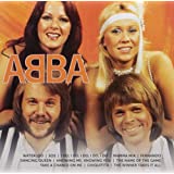
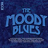
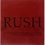
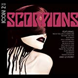
Icon titles that have used band logos or artwork include: ABBA & KISS (both of which are in the same category of iconic as Carpenters' logo), Alien Ant Farm, Anthrax, Bachman-Turner Overdrive, Bob Seger and the Silver Bullet Band, Bon Jovi, Cinderella, Gin Blossoms, Great White, Megadeth, Moody Blues, Motorhead, Nirvana, Nitty Gritty Dirt Band, Parliament, Red Hot Chili Peppers, Rush, Scorpions, Styx, Thin Lizzy, Three Dog Night and War.
")
Rick-An Ordinary Fool
Well-Known Member
I had forgot that The Mook also uses this same photo, here is a quick scan of my Mook.
I was thinking that maybe on some of these shots being closer the tilt is not noticeable, like on The Mook and Time Life but on this Icon being further away and such a clear shot, it is more apparent at least to me.
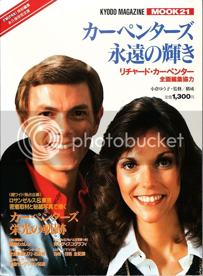
I was thinking that maybe on some of these shots being closer the tilt is not noticeable, like on The Mook and Time Life but on this Icon being further away and such a clear shot, it is more apparent at least to me.
Actorman
Well-Known Member
What a great observation (from a marketing standpoint). I had noticed the lack of "Goodbye To Love", but hadn't put two and two together to see that nothing other than "Top Of The World" had come from A SONG FOR YOU.
This fact allows A SONG FOR YOU to be a valuable second volume to a new listener sampling Carpenters works, since it contains so many hits and is an album that Richard is on the record as being "proud" of.
Of course, it's all silly speculation since the two-disc compilations that remain in print are still all there and of good value. And in these days of downloading individual tracks, it's somewhat of a moot point anyway.
Harry
Thanks! I always think about goofy stuff like that when I look at compilations. I guess it's the music geek (and marketing major) coming out. LOL
And I totally agree with all of your follow-up points.

It looks like this image was indeed tilted toward the left when compared with the other images. It was done possibly to allow for the CARPENTERS text to have "breathing room".
One other think I've noticed is that the CHRISTMAS COLLECTION version of the photo looks like it's been made thinner, while the TIME-LIFE cover looks like it's been made a bit wider. It's most noticeable in Karen's face.
This cover looks like the correct aspect ratio, like the Mook cover.
Harry
One other think I've noticed is that the CHRISTMAS COLLECTION version of the photo looks like it's been made thinner, while the TIME-LIFE cover looks like it's been made a bit wider. It's most noticeable in Karen's face.
This cover looks like the correct aspect ratio, like the Mook cover.
Harry
Rick-An Ordinary Fool
Well-Known Member
So I went into iPhoto and used the straighten feature and straightened it 2.0 to the right and this is what I got. I think the picture looks better, Karen is looking a bit straighter and Richard is still ok but now all the logos are off. LOL
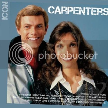
Here is the original
Here is the original
Rick-An Ordinary Fool
Well-Known Member
OMG....this is going to bug me forever now....I guess I have OCD, huh??
- Status
- Not open for further replies.
Similar discussions
- Replies
- 12
- Views
- 429
- Replies
- 0
- Views
- 2K
- Replies
- 13
- Views
- 3K