I thought the Ticket to Ride album cover, and also the back cover photo, were perfect. They looked like brother and sister, in a beautiful setting. I can't figure out why A&M didn't see that and continue in that direction.
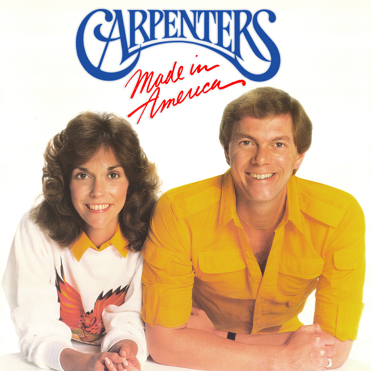
I think it's still too couple-y.
The photograph in my mind for a first cover---put a photographer on a 24-foot ladder in the studio....shooting down at an angle so faces can be seen.
Karen is at the drums, Richard at the piano. They're the only people in the studio. They're not looking at us. They're either playing or talking to each other. If they're talking to each other, Richard has a pen in his hand on the sheet music. Karen's holding drumsticks.
Maybe it's black and white, maybe it's color.
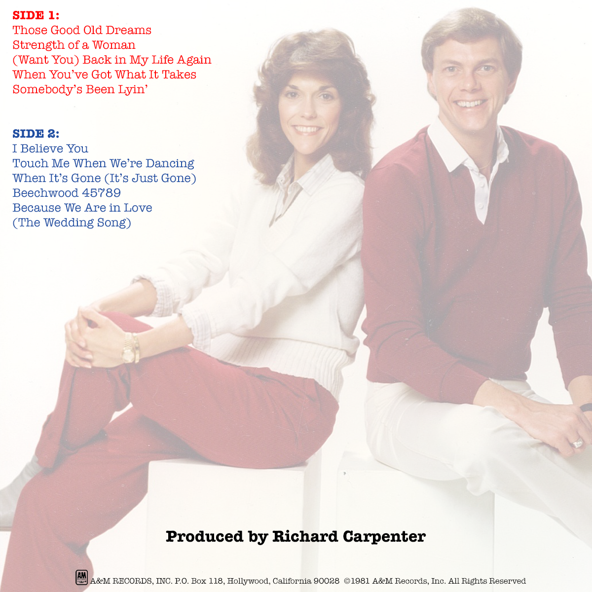
This is the back cover image, accompanied by Herb's original Offering liner notes and the track listing:

Never let it get cuter than that and I think you've fixed the image issue.

")


 Look closer...